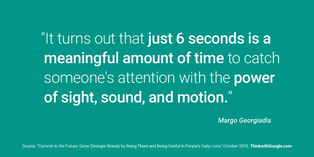
How long do you have to grab someone’s attention online?
We’ve talked a lot about first impressions and the experience your senior living website creates. So this Google thought-of-the week seemed appropriate to share.
If you are working on giving your senior living website a tweak or a complete facelift (like we are doing!) for 2017, keep that number in mind.
6 seconds…
That means a family has to find your site:
- visually pleasing
- easy to navigate and…
- it must be immediately obvious they will find the answer to the question they asked
All in less time than it takes to pop a Kcup in your Keurig and brew a cup of Breakfast Blend…
Tall order right?
Review Your Senior Living Website
“Six seconds” is why, in the hustle and bustle of the holiday season, it’s important to take time out to review your site for missed opportunities. The January lead rush is almost here… make sure your senior living website is ready!
Drop us a note if you need help with your content or strategy! And look for some exciting news and a whole new look for our site in 2017…
